.JPG)
I don’t know how many octopi are caught off the coast of Albania (not
that Lushnjë is even on the coast), but whatever the reason for having a red
octopus as their badge, this is wonderfully bizarre: alien head with eight sucker-less tentacles drawn on. Lev Yashin, the
‘Black Octopus’, didn’t play at the Albanian club (maybe he’d had enough of
everything being red in USSR) but
they did once have Mario Kempes as coach (I shit you not), so they have to be
pretty cool on that basis alone. I only hope they managed to sell a few replica
shirts on the back of the brief fame of Paul, the ‘psychic’ Octopus from the
2010 World Cup.*
* I was very tempted to go with Bari or Doxa Katokopia; maybe next year...
* I was very tempted to go with Bari or Doxa Katokopia; maybe next year...

When it comes to cool football crests, clubs from the former
Soviet bloc have a distinct advantage: Cyrillic inscription. I have only bought
one replica shirt in my life – FC Cherno More (ПФК ЧЕРНО МОРЕ), from Varna , Bulgaria Minsk
crest looks like many from the westernmost republics of the USSR , a corona-like shape enshrining
a single D for ДИHAMO that looks, ironically enough, like one of the initial
letters one might see in the cap or jersey of a Major League baseball franchise.
Anyway, there’s nothing especially outstanding in any of the individual elements
of this crest and I couldn’t really put my finger on why it works so well – it
does, doesn’t it – but it just pips its close cousin, Dynamo Kyiv*, to a place
in the top 10. It reminds me of chocolate.
* Yes, this is the
universally accepted spelling among my #europeanfootballexpert
amigos, even if Iceland

Another monochromatic design, this time centred around a
single large red star (now where have I seen the connection of that symbol
with fitba before?) flanked by the club’s name in both Roman and Arab script – the
latter’s intrinsic, font-transcending beauty attested to by thousands of
hastily conceived tattoos on the arms of people who probably think that all
people from Islamic nations are jihadist psychopaths; the former’s presence
justified by the fact that semi-francophone Tunisia was also once a stronghold
of the Roman Empire (Hannibal, lecteur?).
Based in Soussa , Tunisia ’s
third city, Étoile were the first club to win all the competitions organized by
the African Confederation (only Juve - in Europe, of course - have also managed this feet) so deserve a badge that conveys potency, and nothing conveys potency like a big star. Apart from a fist. Or a hammer. Oh, they're also nicknamed the Red Devils, though quite why a Maghrebian club would have a Viking for their mascot is beyond me...

07: ISTANBUL
There’s an elaborate, Baroque quality to this crest, very
much in step with the wonderfully ornate yet still elegant Islamic architecture
of the first half of the last millennia. This is perhaps surprising, given that
the club is only twenty-two years old in present form, having metamorphosed
from the footballing caterpillar that was the municipality’s water distribution
company team. They have come a long way wuickly, however, and now compete in
the Süper Lig while playing their home games at Turkey ’s
biggest stadium, the Atatürk, 76,000-capacity scene of Liverpool ’s
Six Crazy Minutes™ in 2005. Anyway, the copper and blue colours work well
together, I feel, but the real killer, and that which sets it above its major
city rivals (the ‘Big Three’ of Galatasaray,
Fenerbahçe
and Beşiktaş),
is the incorporation of the minarets of the Hagia Sophia, Istanbul’s most
famous landmark. (Author’s note – they
could well be generic minarets. I giveth nary a fuck.)

There’s a simple design rule when it comes to animals on the
crests of sports clubs: the more representative or naturalistic the image, the
worse it’s likely to look, with the possible exception of eagles. Naturalistic
or not, I do like a good bird of prey – Seattle Seahawks, for instance,
although that could be a Frasier
thing – and the Sheffield Wednesday owl (designed by Jarvis Cocker, Prince
Naseem Hamed, Peter Stringfellow and Roy Hattersley) is beautifully rendered. It’s
positively funky. Perhaps an ornithologist might tell me which breed it is:
tawny, barn, snow or teat?

Simplicity: the eternal key to design (and plans, according to what Walter Sobchak
learned in Vietnam ).
It’s like those round glass ashtrays with equidistant grooves at north, south,
east and west – it cannot be beaten, it will outlast all fads, it should be
embraced as the zenith and subsequent design energy should be expended
elsewhere. So, football crests that look like they’ve come from the heraldry of
some bogusly important family are not at all appealing to me. In fact, they are
as likely as anything to breach my psychopathy hymen, but that’s another yen. Anyway,
quite why a team from Prague
have a green kangaroo as its emblem, lord only knows. I guess they’re just
being, y’know, bohemian. Well, they’ve succeeded.

Before the pandemic cynicism and consumer apathy of us
postmoderns took root, there came an era that believed deeply in the
transformative (political) power of culture (or art, as they preferred to call
it). Indeed, one of the common claims of modernism (which probably died
sometime in the late 1960s) across the various visual arts was that design
could ennoble and civilize. Perhaps the quintessential expression of such
utopianism was in the architecture of men such as Le Corbusier, whose famous Unité
d’Habitation building in Marseille conflated form and function in an ideal
of modern urbanism. Or something. And perhaps it is apt, then, that one of the
great badges of world football is also found in France’s rough-and-ready
southern maritime metropolis, on the famous shirts of the country’s only
European Cup winner (whence the star), L’OM, who call home the imposing,
raucous Stade Vélodrome. “Straight to the Goal” indeed…

False 9 is partial to football badges that resemble the
labels of designer beers or the stamp of quality cheeses and, with all due respect
to Heineken-esque Étoile du Sahel, the best of these is without doubt Polish
fourth division side Orlęta Łuków, a crest in which the town’s possibly un-PC symbol,
the dancing bear, is encircled by the O of an eagle, in a design that would not
look out of place on aforementioned overpriced hops-based libation.

When it comes to design elegance, Paris
already has something of a head start on, say, Rotherham .
Or Cluj. Even so, if you’ve conjured a football club into being in 1970 from
the merger of two pretty unsuccessful ones, and you are looking for an iconic
structure to incorporate into your logo, then it probably merdes all over everywhere else (New York, Rio, Cairo and one or
two others maybe have a shout), including Istanbul. Sorry, Buyuksehir… Beneath
the Eiffel Tower

One of the very, very few football crests that wouldn’t look
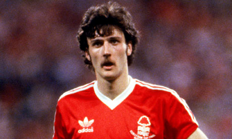
totally shit as a tattoo, Forest’s
ingenious tree-and-river design is the quintessence of simplicity, to an almost
infantile degree (wavy lines = water), while also ticking the design box
marked monochromatic and even being confident enough to throw in a lower case ‘e’ among the capitals. Back in the day when football shirts were unadorned with
players’ names, sponsors’ names, or even manufacturer’s names, Forest ’s white emblem on red shirt looked cool-as,
especially during their romp to back-to-back Big Cups. And for those pious
souls among you who like to fetishize the badge or the shirt as some sort of
eternal or immortal representation of the identity of the club, get this: it
wasn’t the original crest (but I guess you already knew they didn’t do design
like this in the 1860s, right?). Yes, that’s right: they changed it, the
heartless corporate bastards. They ripped the very essence of the club out and
wiped their arses all over it…
20 near misses
And one that didn’t
make the final longlist…
AS Beauvais Oise (France)